Redesigning onboarding experience of Neosky mobile application
Lessons, Insights and learnings of redesigning onboarding experience of mobile application for controlling drone.
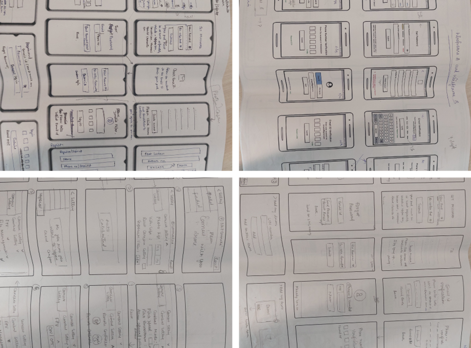
Before
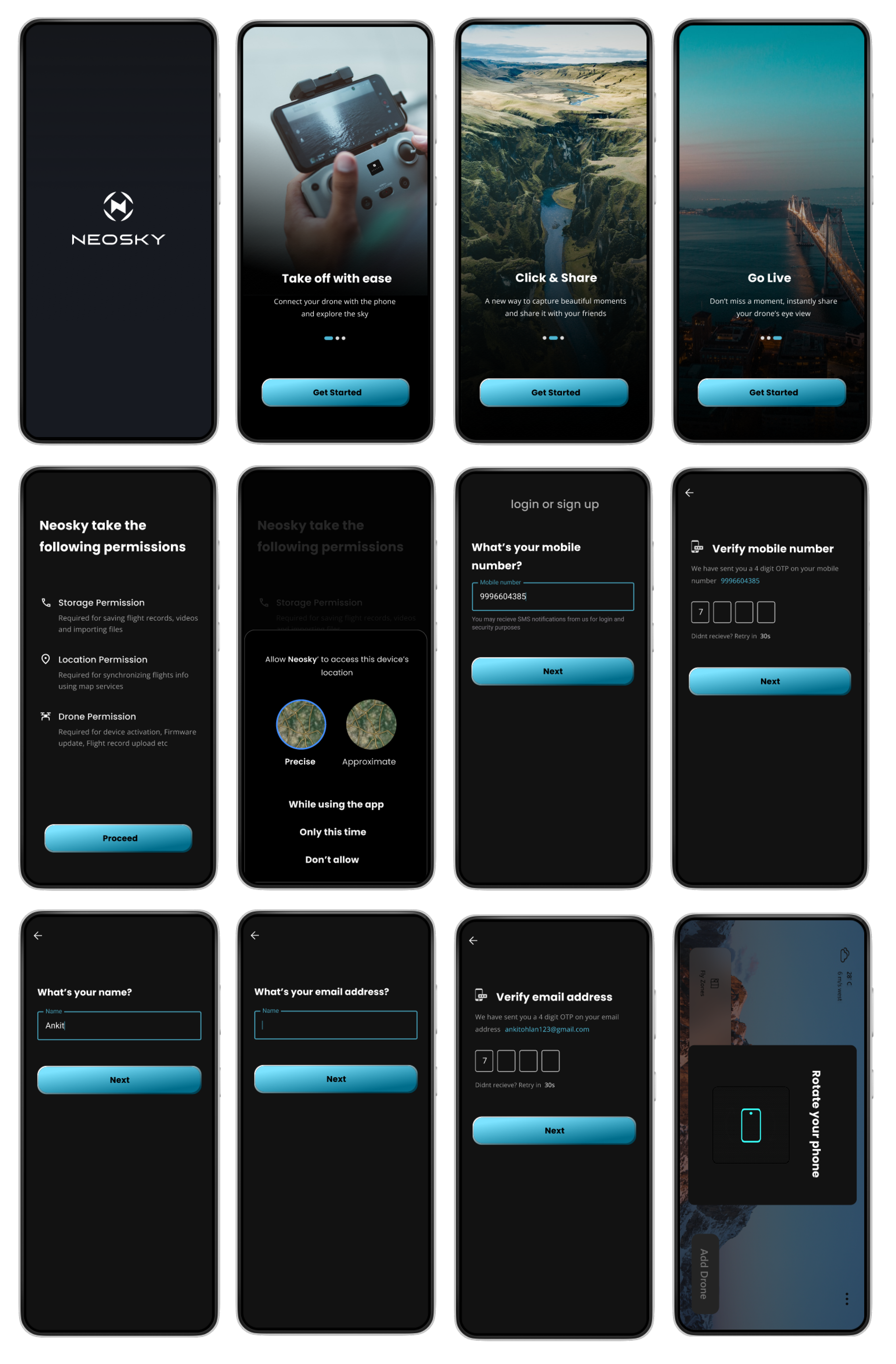
After
where it started
I observed that existing onboarding experience of our application was very cumbersome and error prone. This could potentially result in a subpar customer experience.
Onboarding experience being the first interaction could’ve led customers to perceive overall experience bad. That was a good reason for us to prioritize redesign before product launch.
We decided to conduct usability tests and heuristic evaluation to understand the problem deeper and relook onboarding experience with goal to make it intuitive and delightful.
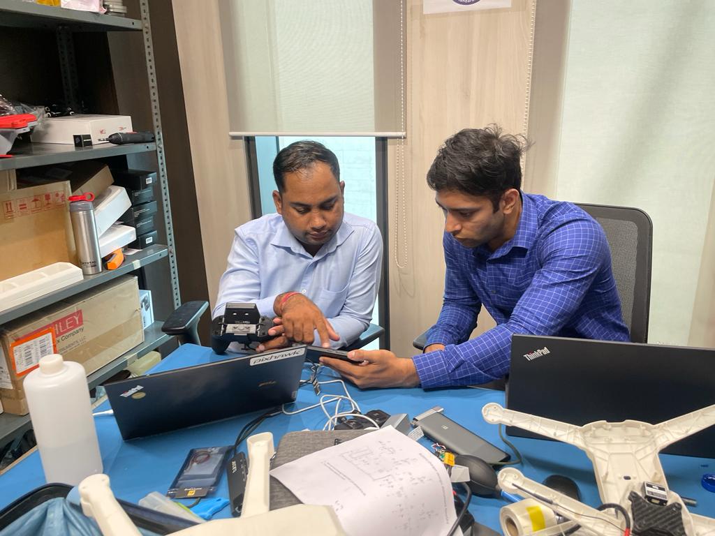
Me (right) doing a usability test with a drone pilot(left)
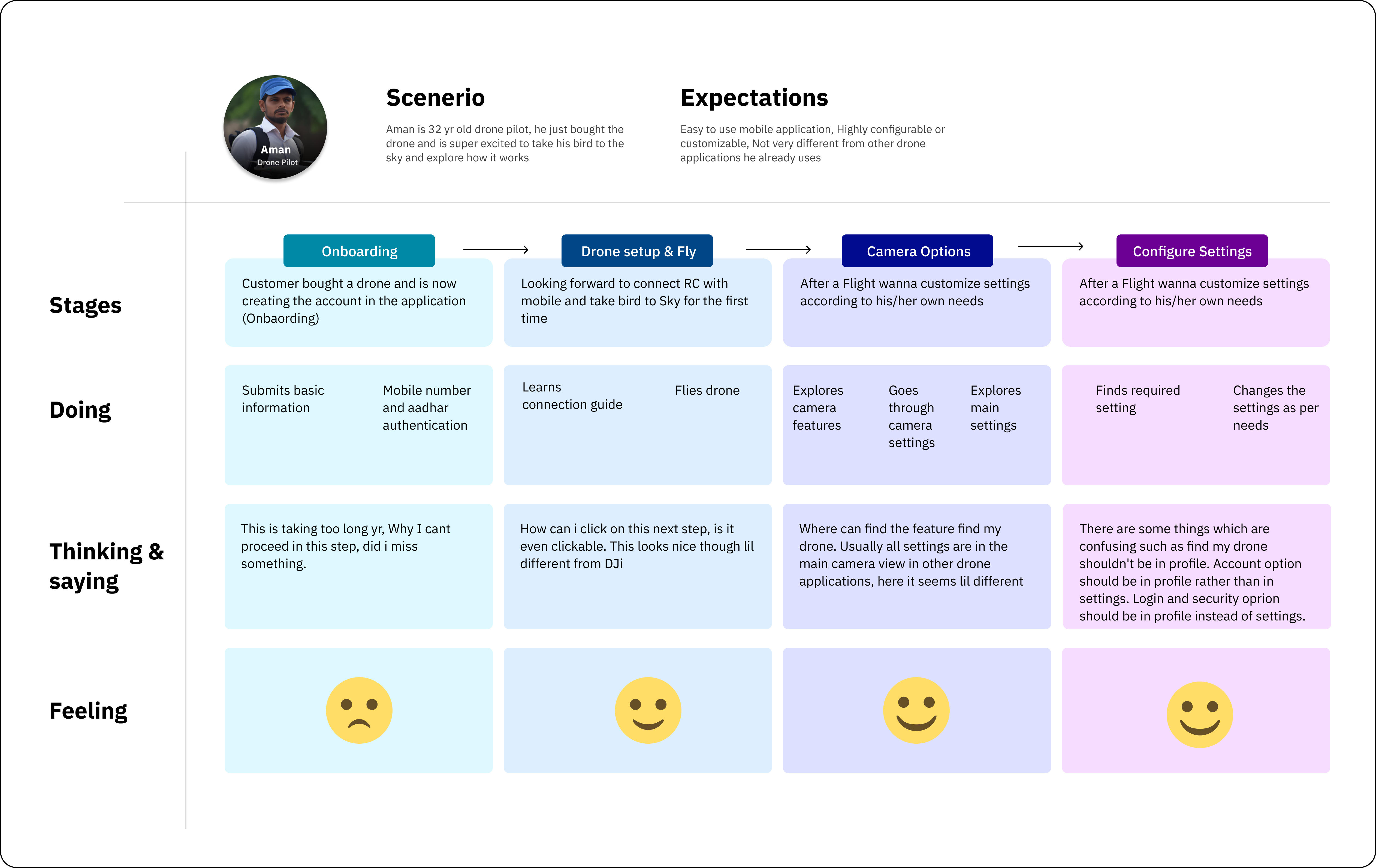
I also made customer journey maps to make our whole team take a walk in our customer’s shoes and experience the product from the customer’s POV.
We identified these key problems
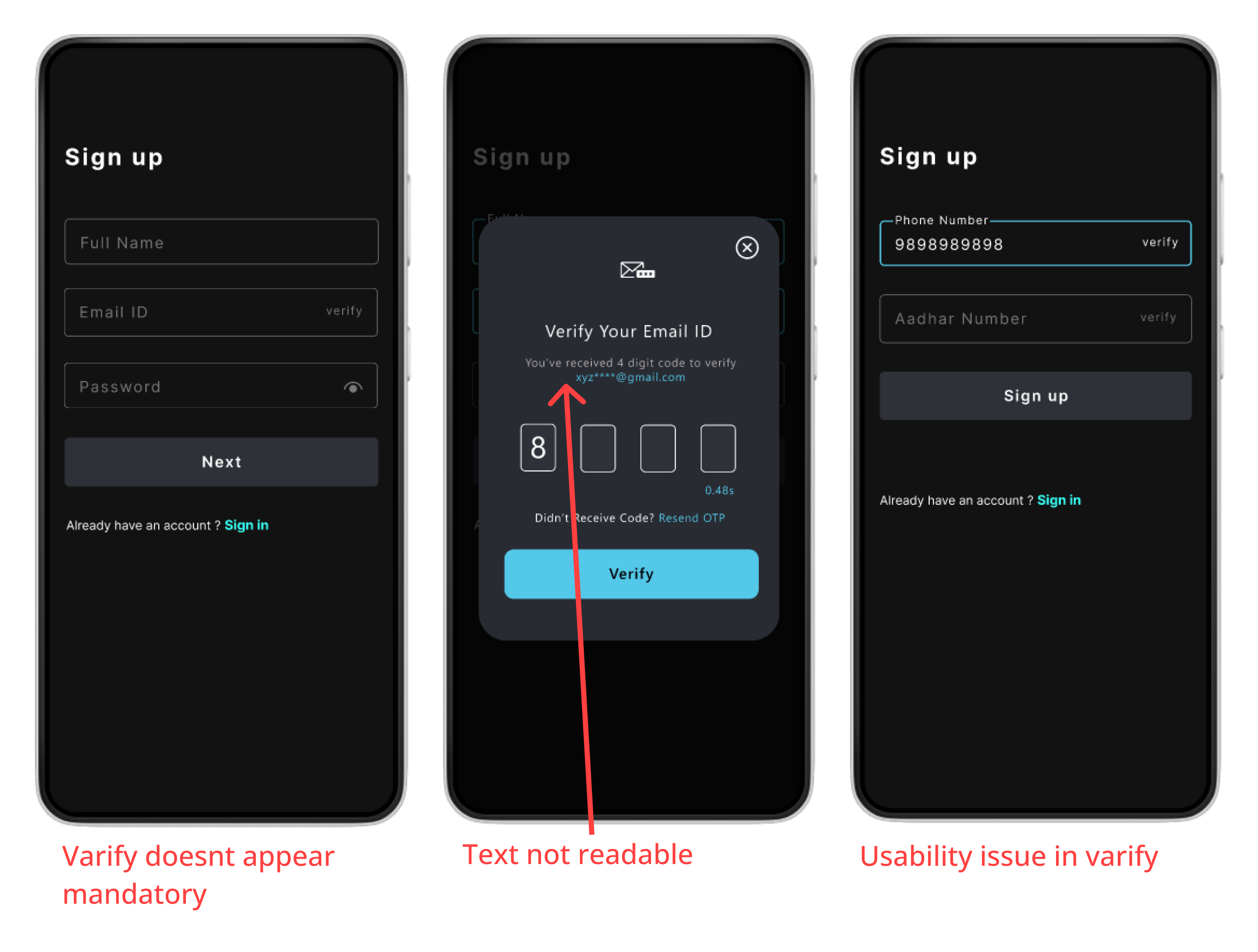
Registration process was tedious
Task completion time found for sign-up was very high leaving many users frustrated. The average time for task completion for core tasks was 6 minutes.
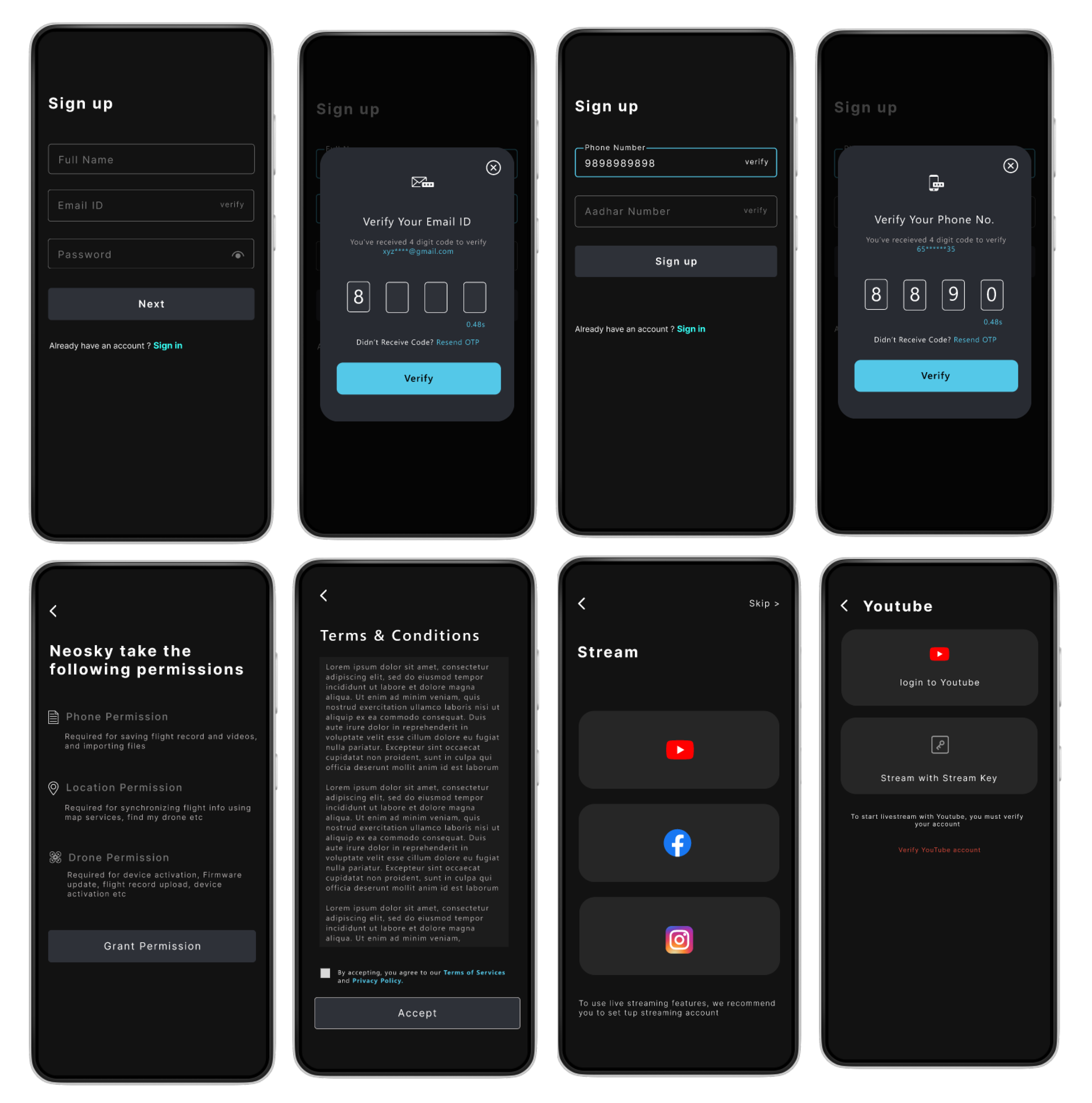
With multiple steps of authentication, registration has become an application for visa. Registration was very confusing and time-consuming due to some usability issues and authentication at multiple steps eg: email, phone number and Aadhaar verification using OTP.
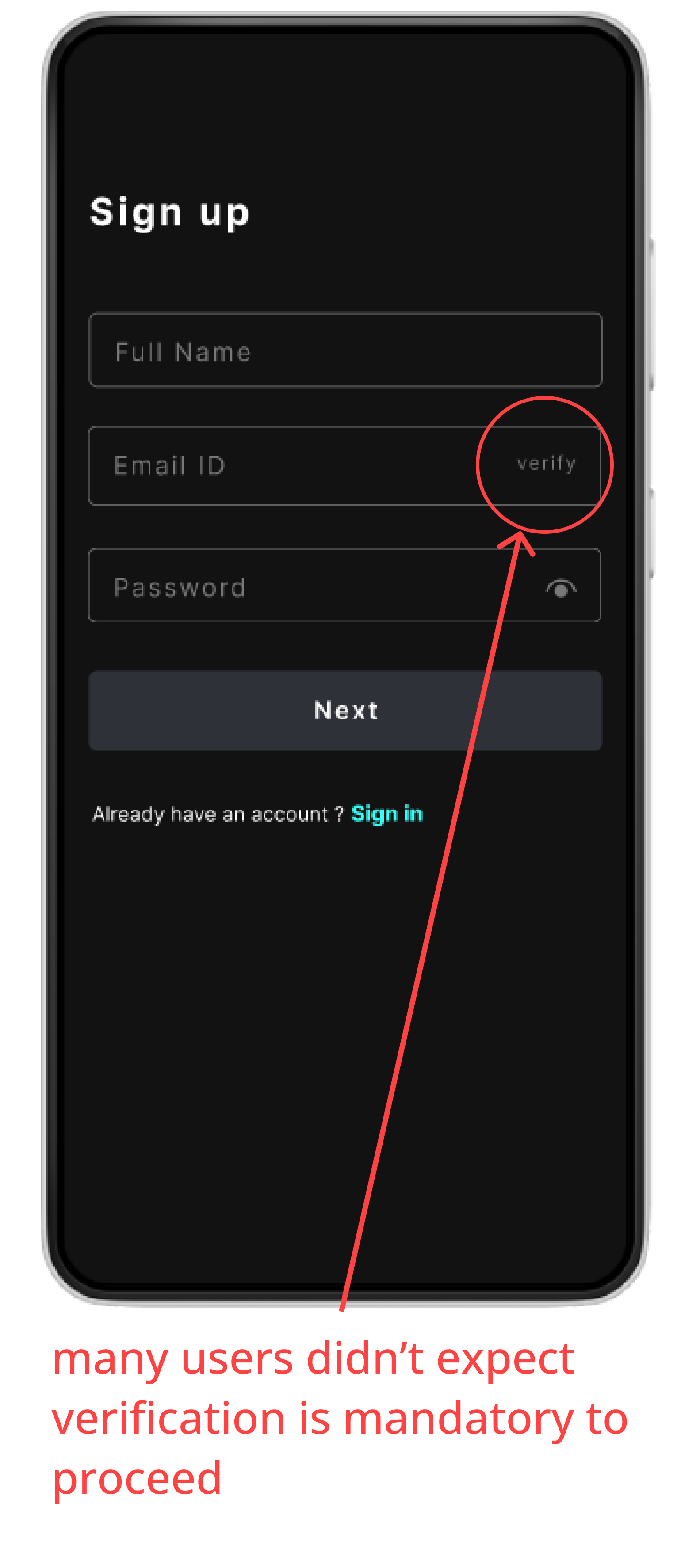
Some critical usability issues for eg: users weren’t expecting verification to be mandatory
Almost 90% of the users mistakenly tapped on next button first. Though some noticed verify button there but were expecting that its optional.
Most of the users thought verify button is optional like usually view icon found in the password field. Hence they skipped it and found themself stuck when trying to go to next page.
I also made customer journey maps to make our whole team take a walk in our customer’s shoes and experience the product from the customer’s POV.
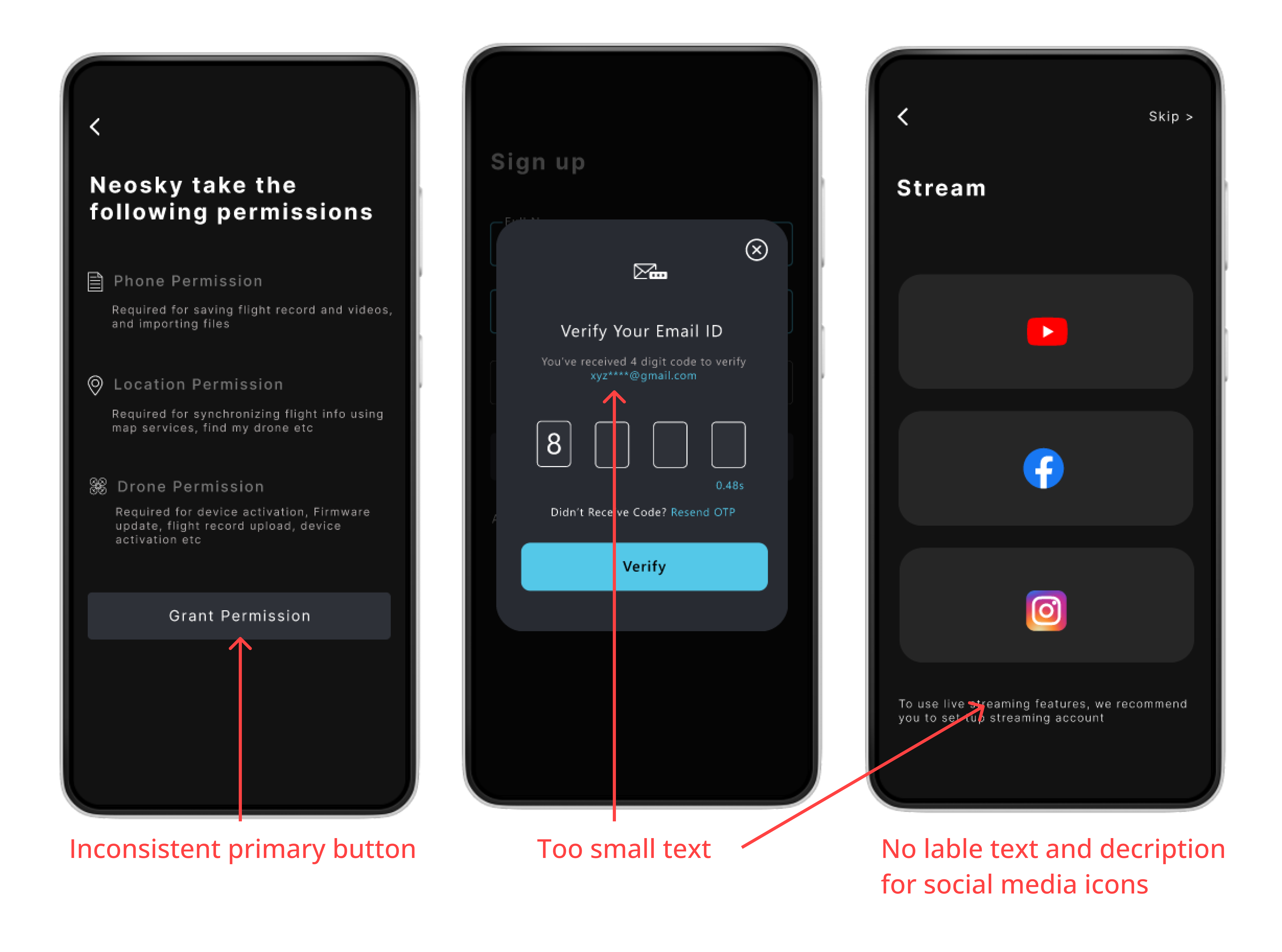
There was a huge scope of improvement in visual design
Most of the users didn’t find design aesthetically appealing and cohesive throughout.
Visual design was inconsistent and aesthetically subpar leading to overall perception of experience no so great.
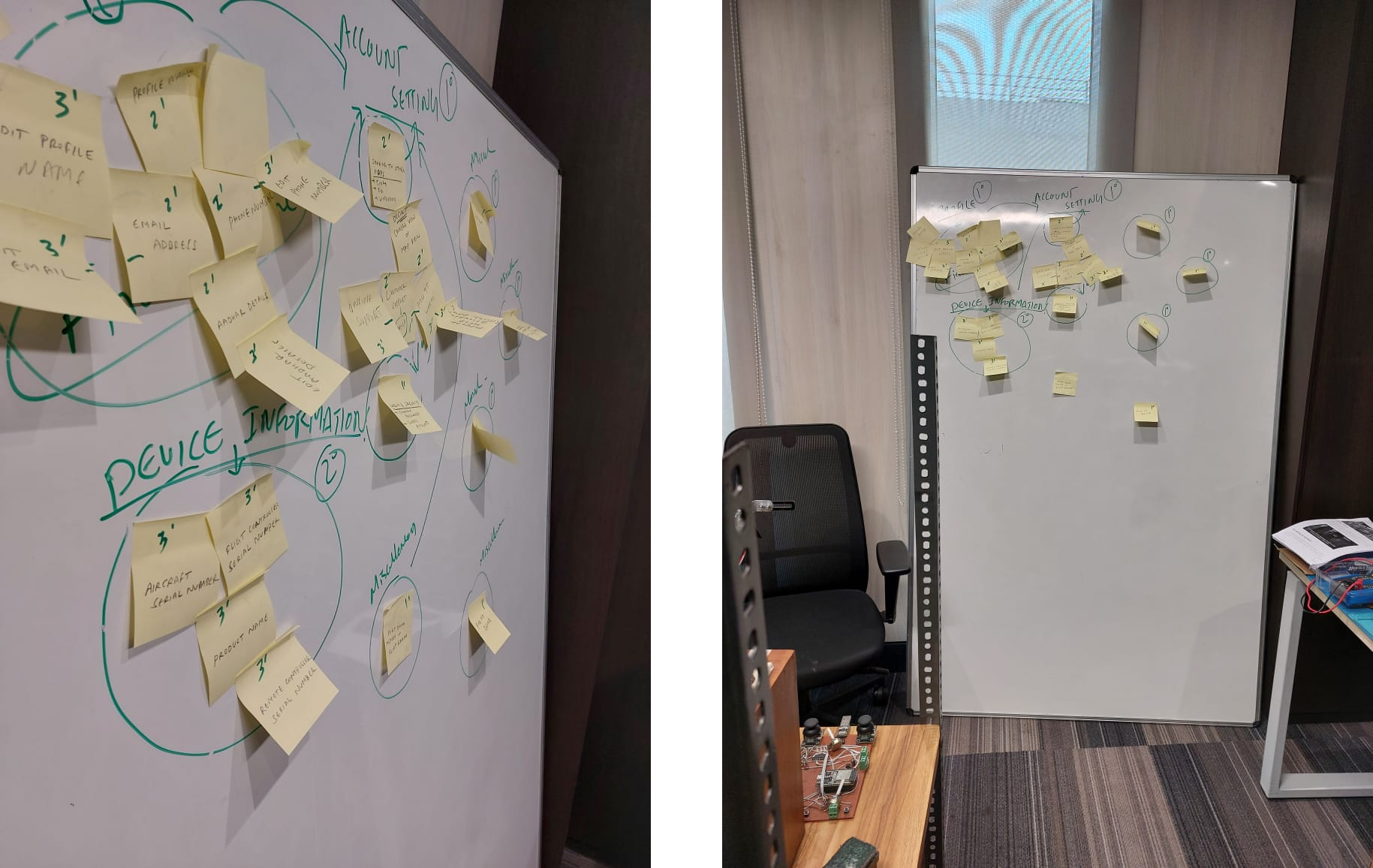
ideation
We generated a broad range of ideas, for inspiration we looked for solution in similar and alternate spaces. Our goal here was to come up with as many ideas as possible before jumping to narrow down our focus. We also did a crazy 8s exercise with cross functional team to build upon each others ideas.
The solutions we came up with
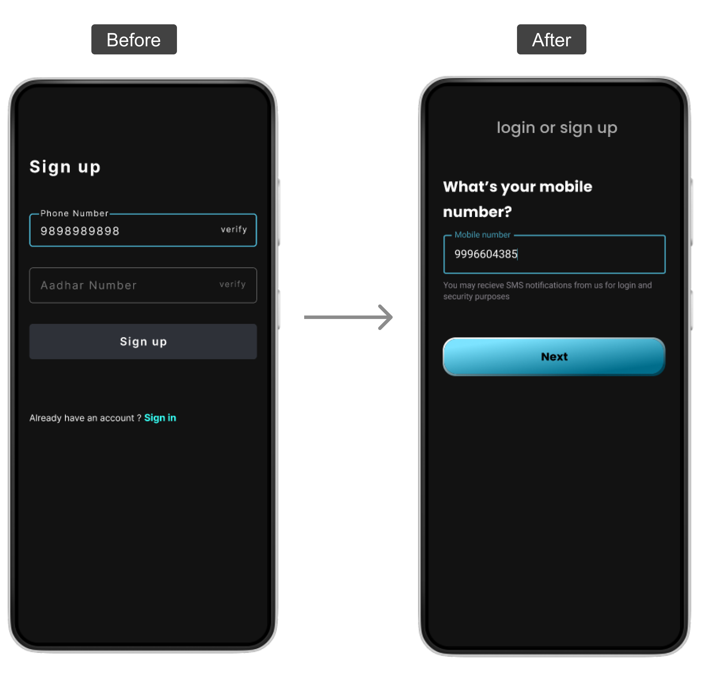
Mobile number authentication based login instead of username and password
Mobile number based authentication instead of username and password
User will enter mobile number and then will verify the same using OTP. Login or sign-up flow will be next steps depending on if user with that phone number is already in database or not. If the phone number is already registered user will be logged in or if the phone number is new user will see sign-up flow.
Fixing usability issues
There were some usability issues in old design for instance: many users didn’t expect that verification is mandatory step hence they skipped and found themself stuck.
Fixing usability issues
Avg task completion time found in usability testing was very high to solve that problem we decided to go with a redesign with less layer of authentication across the sign-up process.
We evaluated all of the potential solutions and then did a dote voting exercise with the team to converge our focus and finalize the concept to be prototyped based on decision matrix. where we compared ideas based on impact and implementation effort.
From here design phase kicked-off
Design
After establishing direction for design I started with rough sketches in order to explore a couple of possible designs without much into details.
Sketches
High-fidelity design
it was time to validate our designed solution by putting it out in front of users.
Now comes the moment of truth
Validate
On of our key problem in old design was tediuos registration process so we again measured how much time and effort registration takes with the new design.
I did the moderated task based usability test using the prototype made in figma. I gave each user a set of tasks to complete in the mobile application. I recorded the task completion time, task success rate and error made by user. alongside I also observed their reactions and responses.
Avg task completion time found was 20 secs which was significantly lower than the previous version.
Along with that we also measured customer satisfaction which also turned out to be significantly better than the old design.
whoa! you made it all the way here. Thanks for reading