Joined as Team’s first Product Designer, I led the strategy and design for the this redesign project. Redesign followed by a subsequent iterations improved the products’ performance across many user experience metrics.
The Challenge
Manya – The Princeton Review despite being one of the top players in the space was lagging at the tech end. Various platforms from various third party vendors were used for content delivery leading to the disconnected, non-cohesive and poor user experience.
My Role
I joined as company’s first UX designer, led the project from user research to final prototype and subsequent iterations.
Approach
To get a deeper understanding of users I started with an extensive user research. followed by design sprint with subsequent loop of think, build and measure. with a diverse team of awesome people.
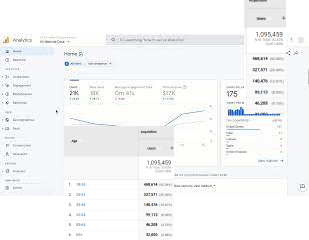
Analytics
There was no documented user persona hence everyone’s understanding of user was different, So I started with digging historical data and analytics to define and document a user persona to create a shared and common understanding of user among teams.
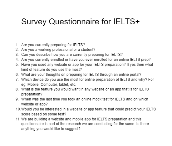
Survey
With 50+ Centers spread across PAN India clocks thousands of students. It was a great opportunity which we couldn’t miss so I conducted a survey in which I shared a set of questionnaires. With feedback on a scale we got the answer to “what”. Now we needed to know why with in-depth user interviews.
Focus group study
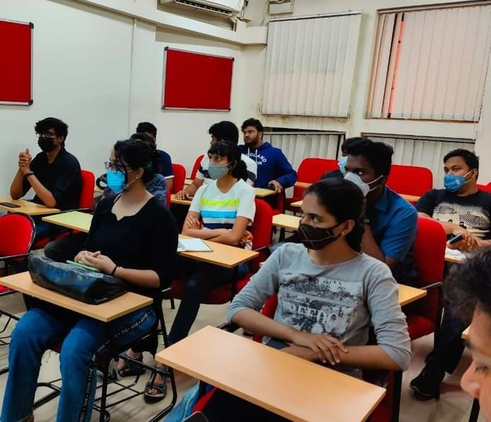
Yes I did focus group study too, too avoid the problem of homogeneity I gave every participant a paper to write their responses. It was quick and got good insights.
User Interviews
Started a sponsored user program, In that I onboarded students that would closely work with us in a participatory design process. As they say greatest products are built by people solving for themself. We co-created the product with the students who would use it.
Usability test
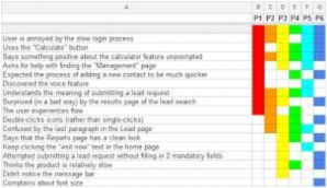
Tested the existing content delivery platform for IELTS by moderated remote task based usability tests. To visualize the qualitative data in quantitative form. Made a spreadsheet highlighting each user’s errors with specific.
Unsolicited Feedback
With 50+ Centers spread across PAN India clocks thousands of students. It was a great opportunity which we couldn’t miss so I conducted a survey in which I shared a set of questionnaires. With feedback on a scale we got the answer to “what”. Now we needed to know why with in-depth user interviews.
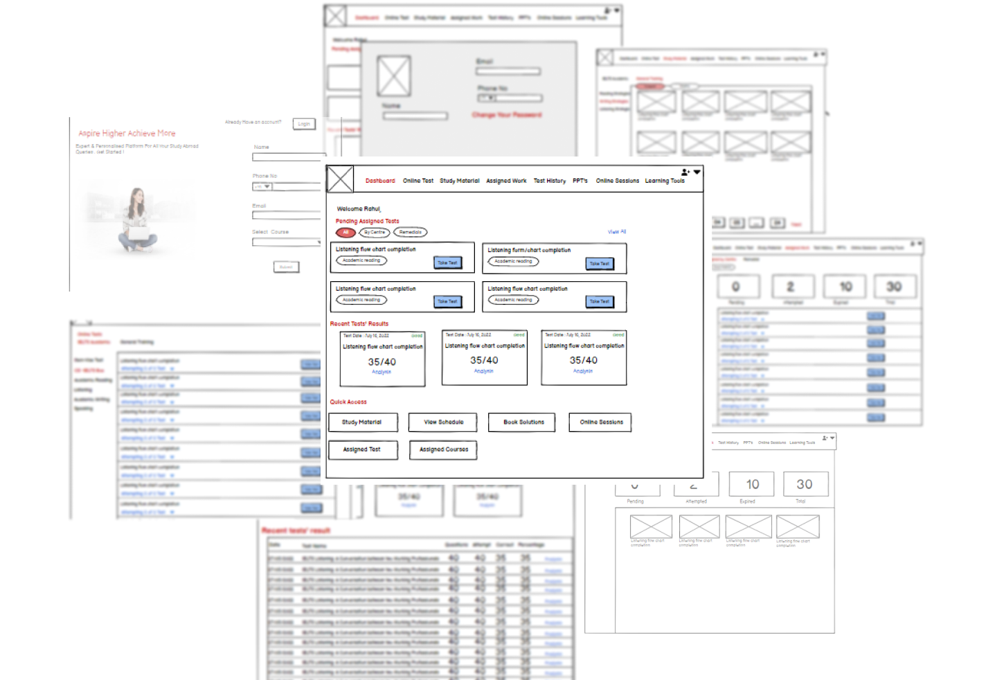
Sketching and wireframing
We did the sketching in design sprint where we generate a lot of ideas and for inspiration we also looked for solutions in alternative spaces .
After we finalized sketched solutions to go ahead with using dote vote. Then I made wireframes to embody the ideas into tangible low fid screens. Then I tested the wireframes with sponsored users and got some great insights that I used to inform the high fidelity design.
Mockups
Based on the insights from testing wireframes with users and stakeholders, I started the high fid mockups and prototype to again test the solution with users. I used the Manya’s existing style guide with some modifications.
I also tested the design with color blindness simulation tools to make sure the design is accessible for people with various form of color related disabilities.
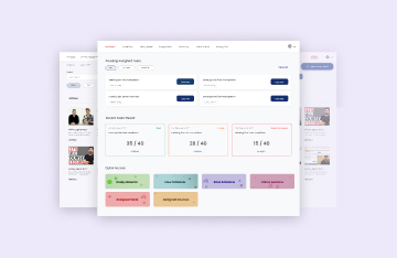
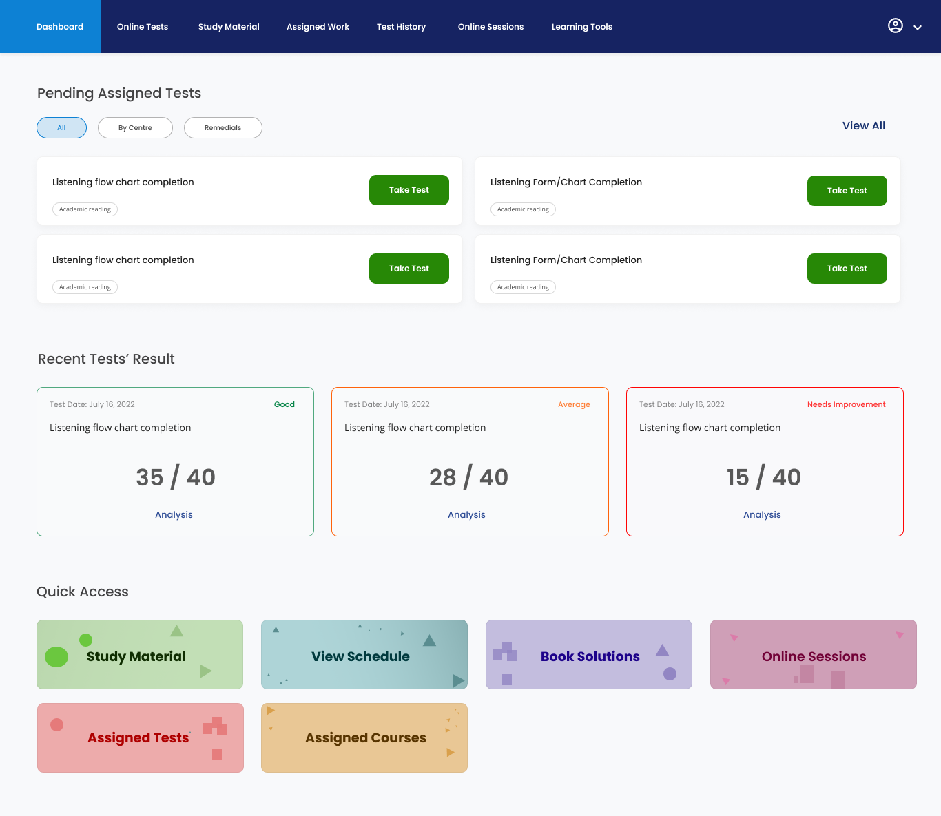
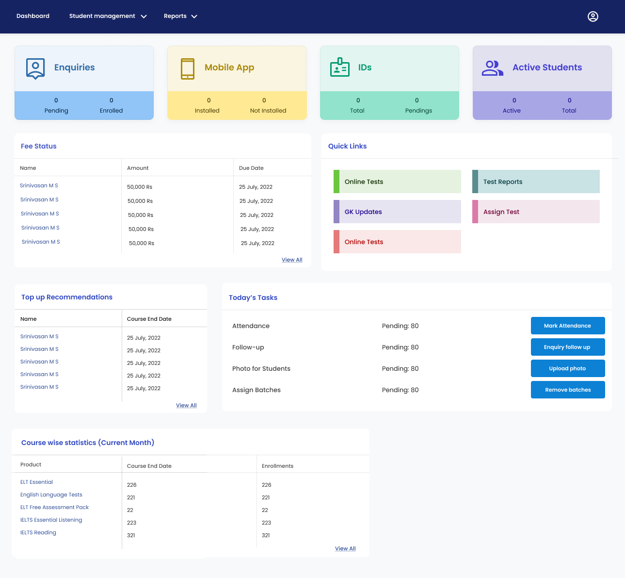
Dashboard
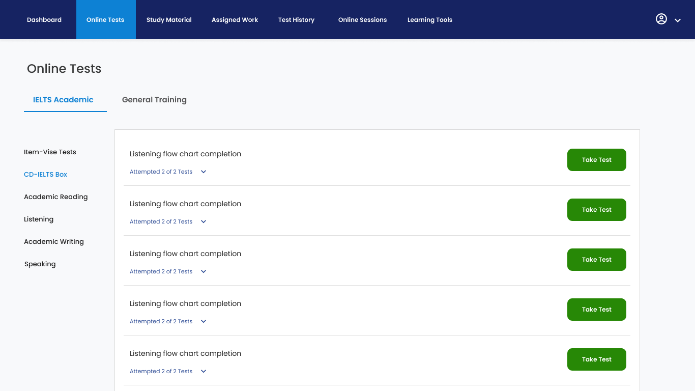
Online Tests
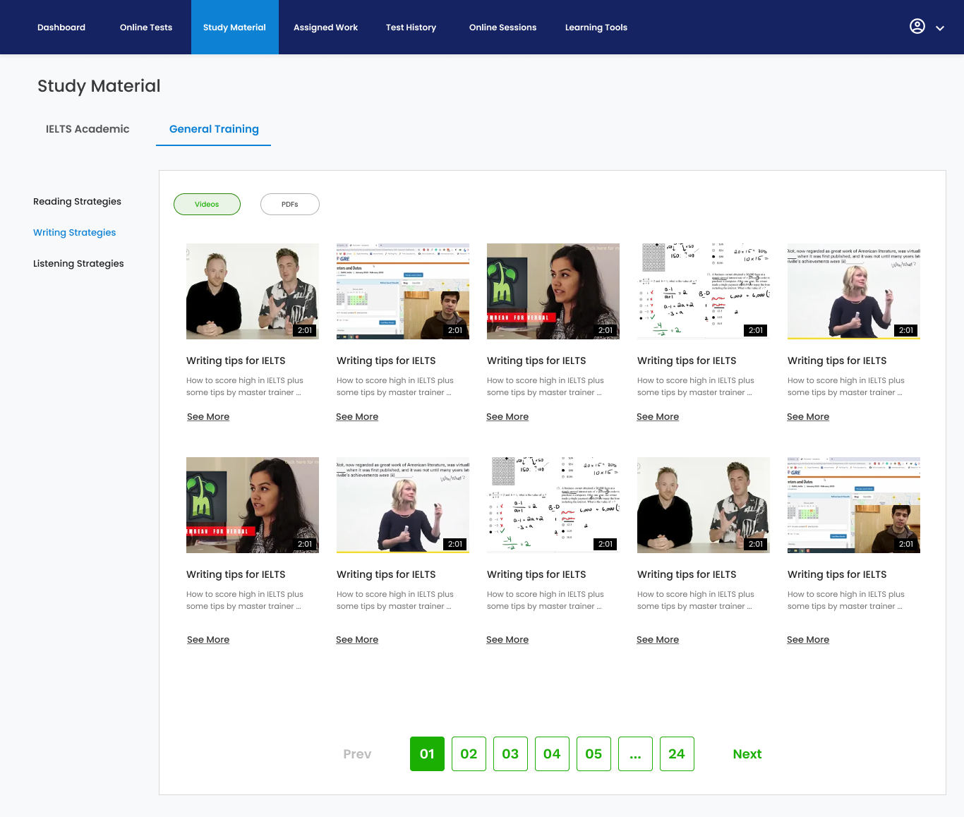
Sudy Material
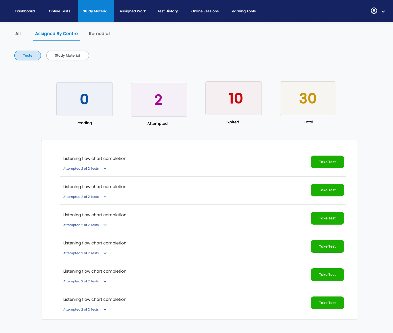
Assigned work(Study material and tests)
Assigned work(Study material and tests)
Code Development
Coordinated with developers and redesigned some of the micro-interactions which were technically challenging to develop to make sure we ships the product on time.
Participants tested the new design of test prep portal on a figma prototype. The participants were comprised of students resembling to user personas designed earlier. The task based usability tests were performed remotely and in-person.
Design was evaluated on various attitudinal and behavioral proxies such as: task success rate, avg time to complete task, error rate, search vs navigation, system usability scale, net promoter score and customer satisfaction. I created an affinity map to synthesize the responses and observations I captured from testing. The new design drastically improved the performance across many user centered metrics concluded from the following insights we derived from the findings of user testing:
All participants were able to successfully completed all of their given tasks; however avg time to complete a task got increased. Assuming that might be due to first time using the product. We’ll be validating this assumption in a week or two.
Customer satisfaction score increased by 32%.
Improved SUS score (system usability score) from 20 to 80.