Manya – The Princeton Review, the largest partner of The Princeton Review (The Princeton Review headquartered in New York, is a part of ST Unitas, South Korea’s largest ed-tech company) globally, offers an end-to-end eco-system for all higher education requirements for students in India.
My challenge was to create a web and mobile app for students that will be used for IELTS preparation. Using the Design Thinking method, I set out to design a solution that would deliver students a usable, useful and enjoyable experience considering the needs of target user, the objectives of the company and technical capabilities.
Length of Project: 3 Weeks
My Role: Product Designer
Length of Project: 3 Weeks
My Role: Product Designer
Here we go!
I started with the research as precursor to design sprint..
Here we go!
I started with the research as precursor to design sprint..
Research
Research
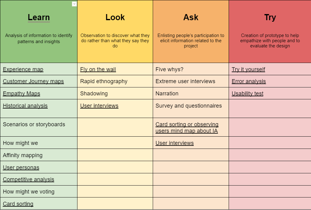
During the project here is the list of empathy tools I’ve used to build empathy with users to better understand their experiences, behaviors, perceptions, needs and motivations.
For the first iteration I used underlined techniques from the methods mentioned in this table.Other methods were put in backlog for subsequent sprints.
User Interviews: Starting with the participatory design approach. Where we onboarded one user from each persona(3 personas). Which we call “sponsored users” to continuously get there feedback from early stages of design. We inquired about scope of improvement in current product through cognitive walkthrough sessions.
Meanwhile we did a competitors analysis to identify what has been done and what needs to be done.
Competitive Analysis: With research goals in mind, I gathered contextual information about the IELTS prep market and identified a baseline for what users expect. The competitive analysis revealed the strengths, weaknesses, similarities, and differences in the industry.
Findings from user reseach
Findings from user reseach
Quantitative study and cognitive walkthrough uncovered critical and minor usability issues in current experience: Avg time to complete a task was high, task success rate was low especially in admin modules, Poor performance on system usability scale.
Speaking Room, score predictor, and AI course finder are great features.
Video lessons with asking an expert as an addon could be a good alternative to live classes only. It would set teachers free to give personalized guidance.
The mobile app is a must
Community is a key to attracting and engaging users
The Design Sprint
I along with my teammates followed the design sprint methodology to redesign the new experience for IELTS preparation. Design sprint quickly aligned the team under a shared vision with clearly defined goals and deliverables. By the end of the sprint we were able to prototype and test our ideas with our users.
I along with my teammates followed the design sprint methodology to redesign the new experience for IELTS preparation. Design sprint quickly aligned the team under a shared vision with clearly defined goals and deliverables. By the end of the sprint we were able to prototype and test our ideas with our users.
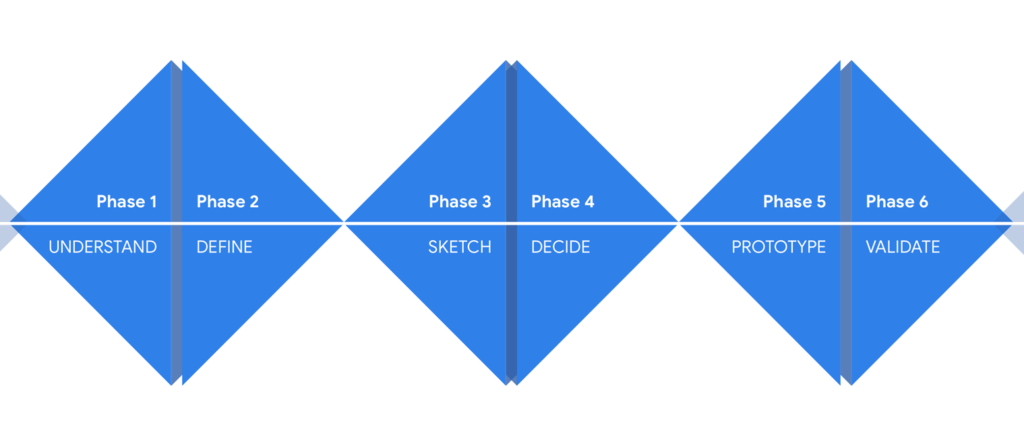
Here is an overview of our week long design sprint:
Here is an overview of our week long design sprint:
Understand (Day 1): Created a shared knowledge base & vision across all participants by sharing user personas, empathy maps, user journey maps and competitive analysis. After building empathy for user among participants we did HMW.
Define (Day 2): We chose focus of the sprint and defined goals, success metrics and signals.
Sketch (Day 3): Team generated lot of ideas by building upon each others’ ideas using crazy 8s sharing and voting method.
Decide (Day 4): We finalized the concept to be prototyped using dot vote and cost and benefit analysis.
Prototype (Day 5) : The prototype phase kicked off by planning the information architecture. Insights from the card sorting with users and task based usability study with early sketches were used to understand the users’ mental modals. This findings from this research is then used to inform the IA.”
Prototype we designed to learn from users’ first hand interaction & to evaluate the concept
Understand (Day 1): Created a shared knowledge base & vision across all participants by sharing user personas, empathy maps, user journey maps, competitive analysis. After building empathy for user among participants we did HMW.
Define (Day 2): We chose focus of the sprint and defined goals, success metrics and signals.
Sketch (Day 3): Team generated lot of ideas by building upon each others’ ideas using crazy 8s sharing and voting method.
Decide (Day 4): We finalized the concept to be prototyped using dot vote and cost and benefit analysis.
Prototype (Day 5) : The prototype phase kicked off by planning the information architecture. Insights from the card sorting with users and task based usability study with early sketches were used to understand the users’ mental modals. This findings from this research is then used to inform the IA.”
Prototype we designed to learn from users’ first hand interaction & to evaluate the concept
Testing (After a week)
Participants tested the new design of test prep portal on a figma prototype. The participants were comprised of students resembling to user personas designed earlier. The task based usability tests were performed remotely and in-person.
Design was evaluated on various attitudinal and behavioral proxies such as: task success rate, avg time to complete task, error rate, search vs navigation, system usability scale, net promoter score and customer satisfaction. I created an affinity map to synthesize the responses and observations I captured from testing.
The new design drastically improved the performance across many user centered metrics concluded from the following insights we derived from the findings of user testing:
All participants were able to successfully completed all of their given tasks; however avg time to complete a task got increased. Assuming that might be due to first time using the product. We’ll be validating this assumption in a week or two.
Customer satisfaction score increased by 40%.
Improved SUS score (system usability score) from 20 to 80.
Participants tested the new design of test prep portal on a figma prototype. The participants were comprised of students resembling to user personas designed earlier. The task based usability tests were performed remotely and in-person.
Design was evaluated on various attitudinal and behavioral proxies such as: task success rate, avg time to complete task, error rate, search vs navigation, system usability scale, net promoter score and customer satisfaction. I created an affinity map to synthesize the responses and observations I captured from testing.
The new design drastically improved the performance across many user centered metrics concluded from the following insights we derived from the findings of user testing:
All participants were able to successfully completed all of their given tasks; however avg time to complete a task got increased. Assuming that might be due to first time using the product. We’ll be validating this assumption in a week or two.
Customer satisfaction score increased by 40%.
Improved score on system usability scale from 20 to 80.