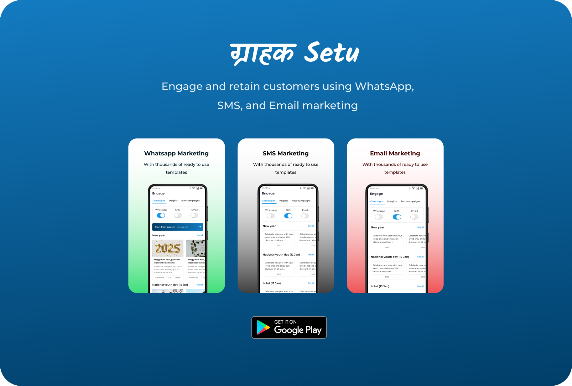
A mobile platform to help Indian SMBs market like big brands
Project Overview
Grahak Setu is a mobile-first customer engagement platform built to empower small and medium businesses in India. It enables them to promote their products and services like big brands—through bulk messaging on WhatsApp, SMS, and Email, payment reminders, and commission-free UPI payments.
As the Product Designer and Co-founder, I was responsible for shaping the product experience from the ground up—research, strategy, interaction design, and UI—closely collaborating with the founding team and engineers.
Goals
Build a simple, intuitive app that even first-time smartphone users could adopt
Enable seamless bulk messaging through WhatsApp, SMS, and email
Design features for transaction management, payment links, and reminders
Ensure scalability for future modules (auto-campaigns, CRM, analytics, etc.)
Research Methods
8 one-on-one interviews (in person and over phone)
What’s your biggest challenge in reminding customers to pay on time?
How comfortable are you with WhatsApp, SMS, and email marketing tools?
Key insights
WhatsApp is King
“Sab kuch WhatsApp pe hota hai. Whatsapp pe hi dekhte hai log or conversion bhi wahi se aata hai.” – Rohit (a salon owner) Most users preferred WhatsApp over SMS and email due to trust and familiarity. They often used it for sending offers manually.
Lack of Time & Tech Know-How Users didn’t want to learn complicated flows. They needed 1–2 tap actions that “just work,” preferably with visual guidance (icons, templates).
Reminder Fatigue They struggled with keeping track of who owes what. They wanted gentle, recurring reminders without sounding pushy.
Low Trust in New Apps First-time users are skeptical of unknown apps, especially if setup takes time or looks “too modern.” Simpler UI = more trust.
Multi-Language Need While Hindi was the preferred language, users often switched between Hinglish. This pushed us to prioritize localization planning.
These insights directly shaped our design decisions—favoring template-based flows, WhatsApp integration, simple UI hierarchy, and later, plans for language toggles and visual onboarding.
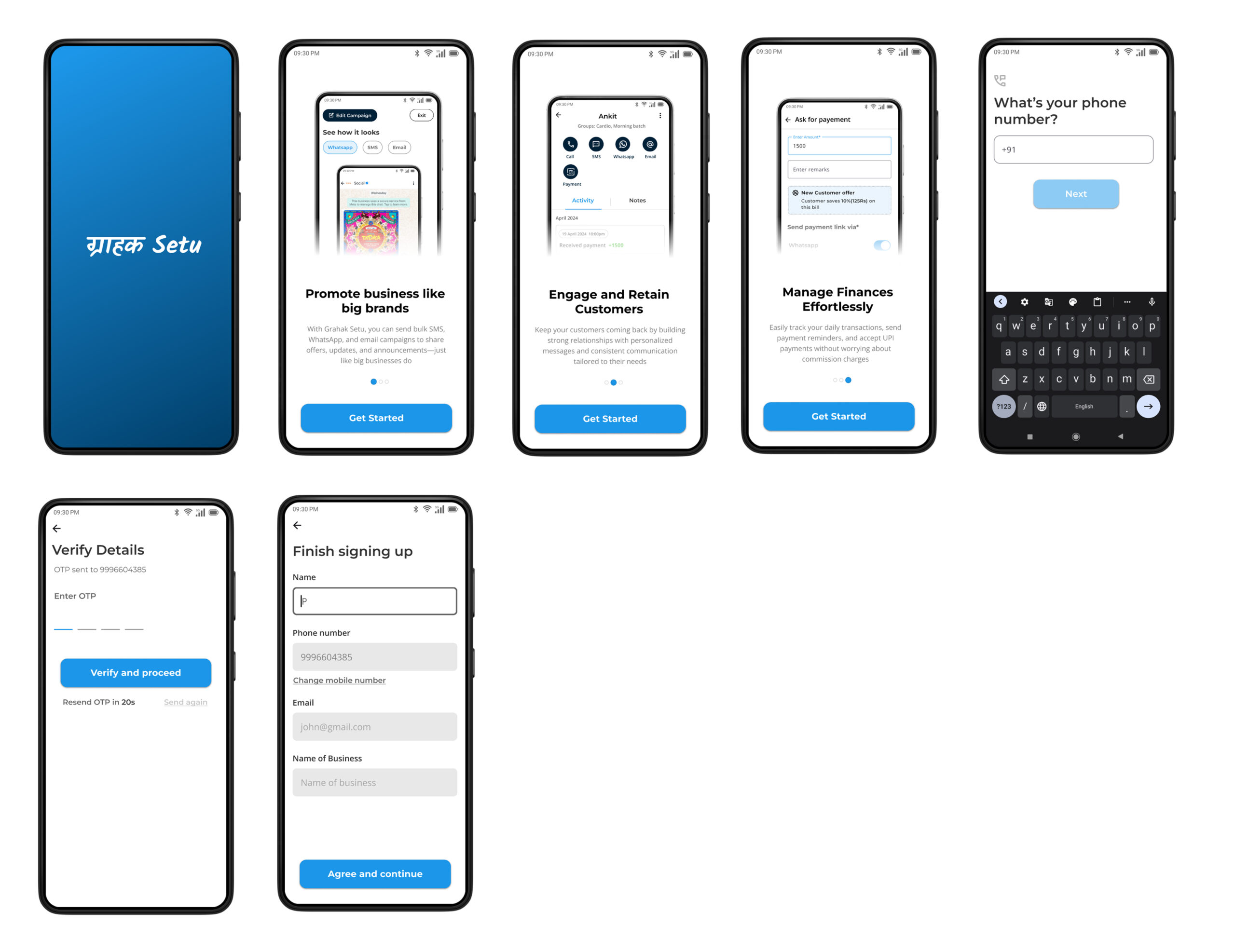
Onboarding flow
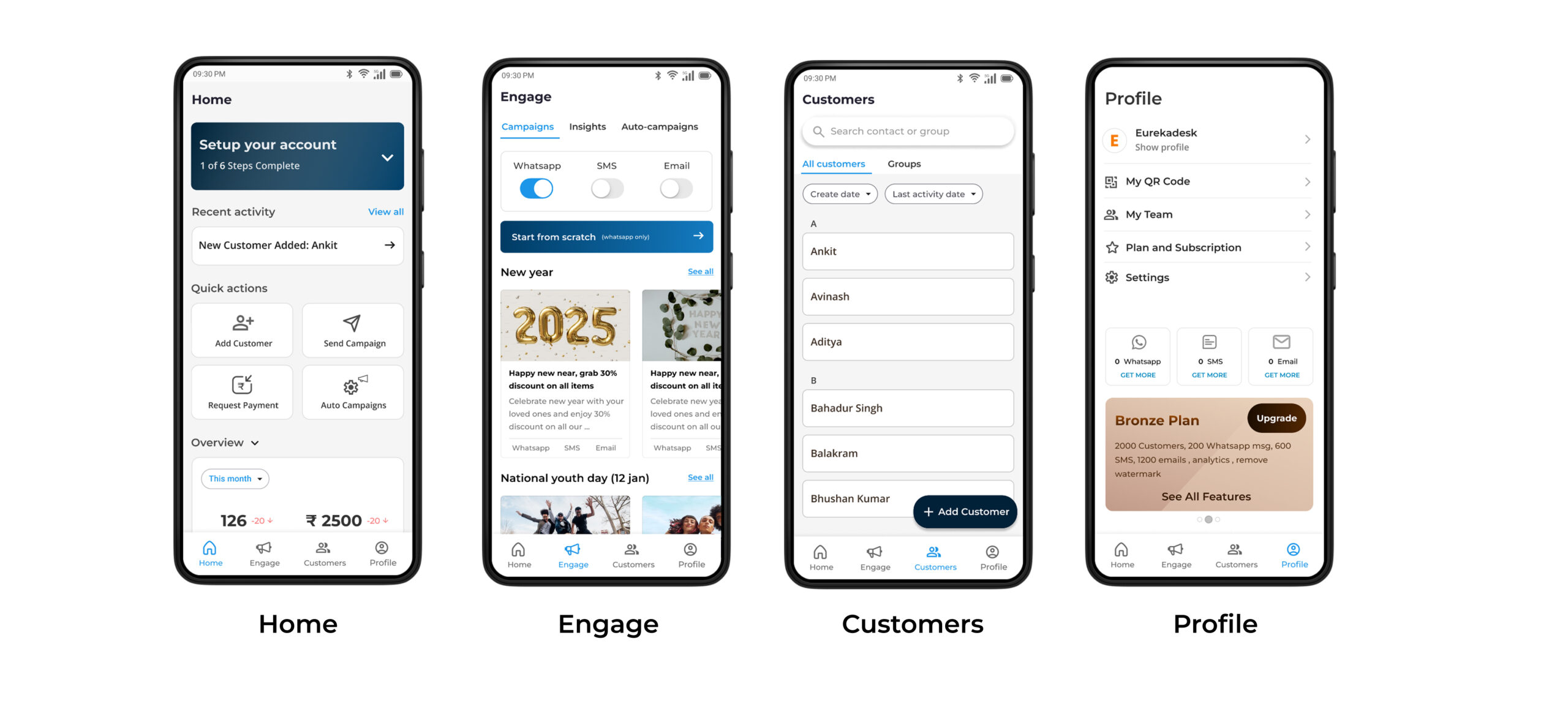
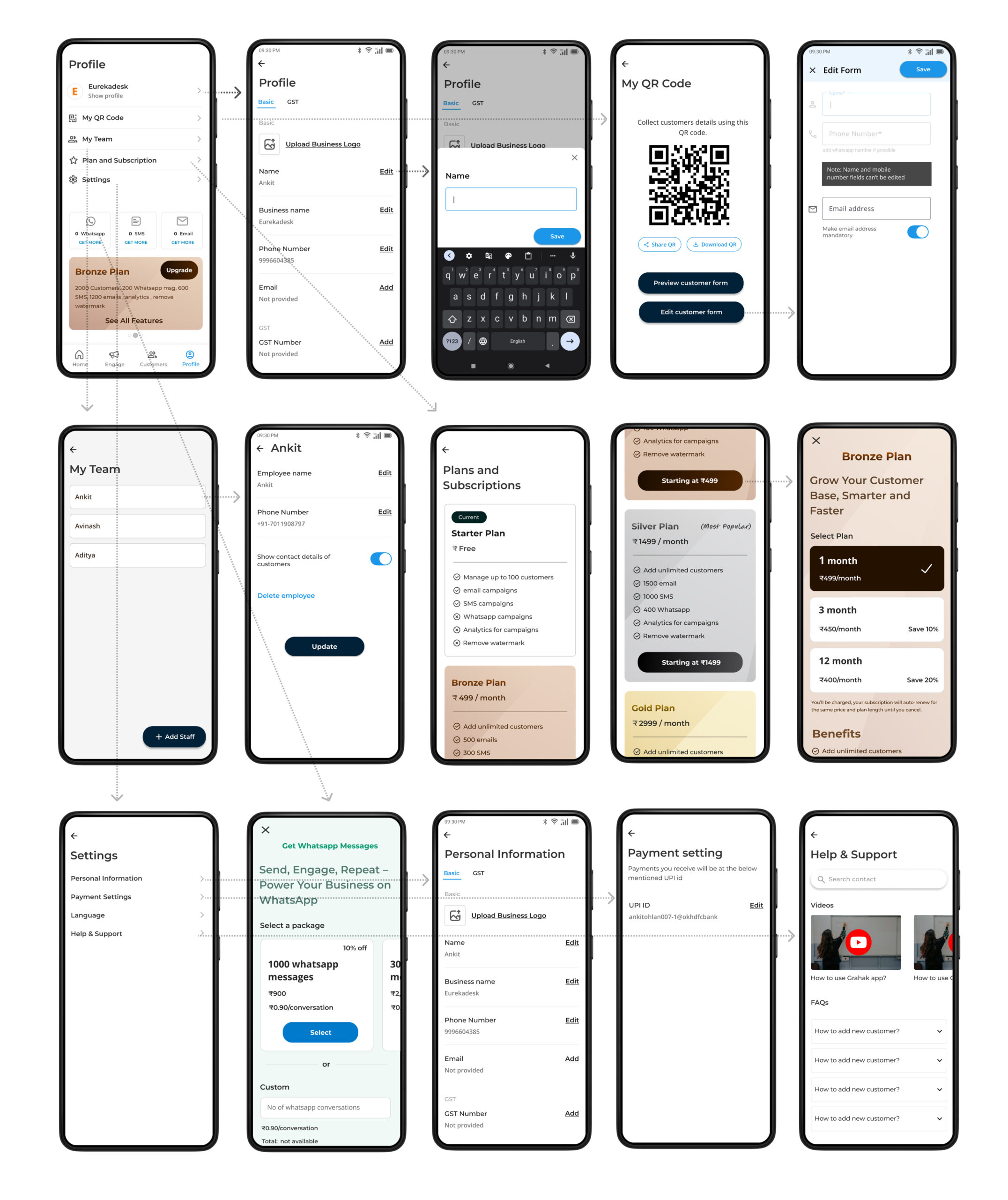
Main Navigation
Engage
Customers
Profile
Design execution
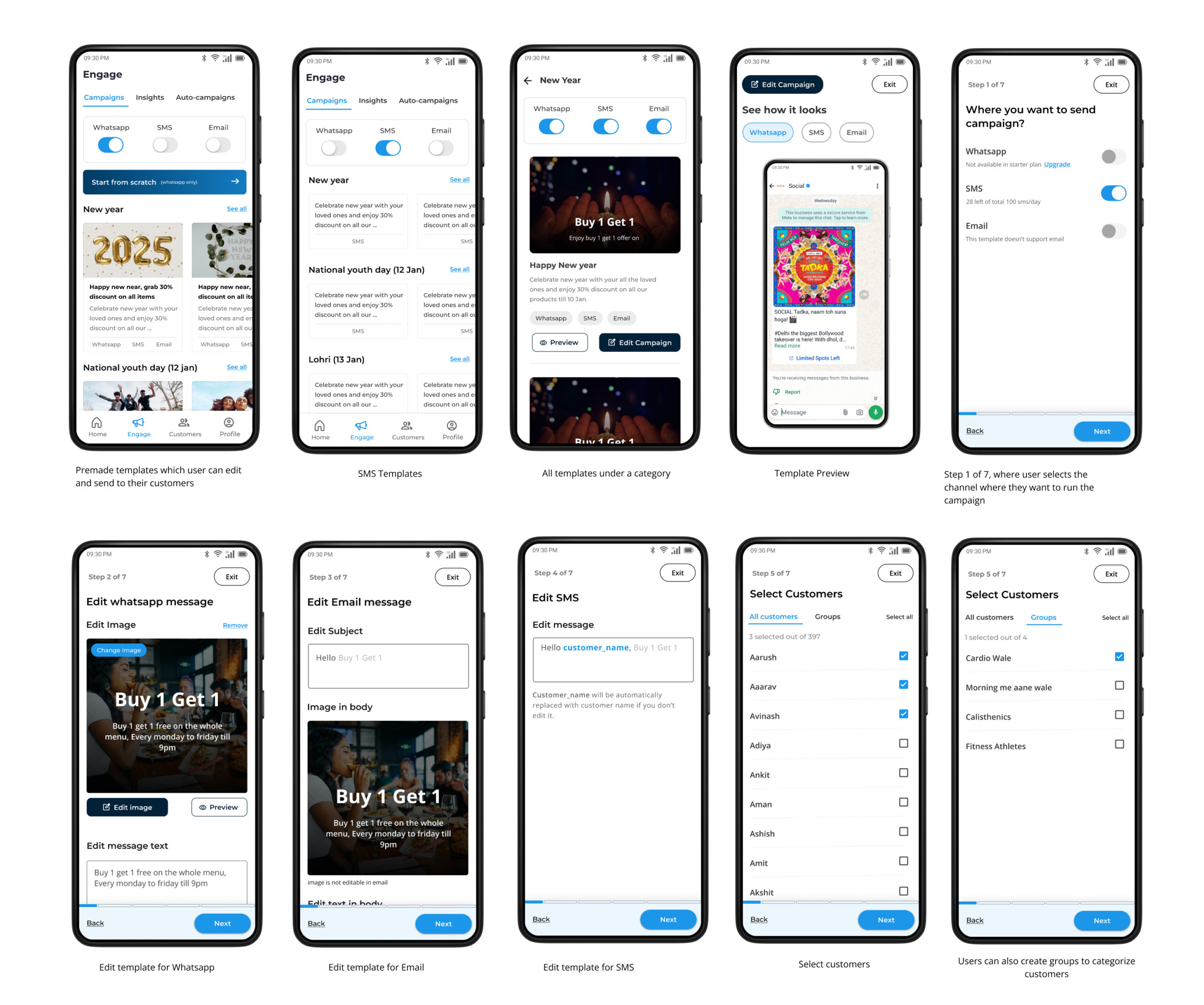
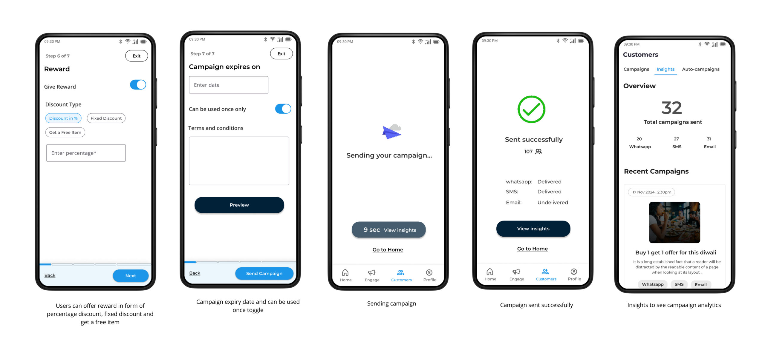
Template-Driven Campaign Creation
To enable small business owners to engage their customers like big brands, we created a set of pre-made, ready-to-use templates. These templates included categories like promotional offers, festive greetings, and payment reminders—designed with simple language and intuitive visuals. The goal was to minimize friction and allow users to create and send messages in just a few taps.
WhatsApp-First Communication
Most of our users were already actively communicating with customers over WhatsApp. Instead of asking them to change their behavior, we leaned into it. With WhatsApp integration, users could send personalized, high-conversion messages using our templates or custom messages—directly from the app. This increased campaign delivery and visibility rates significantly.
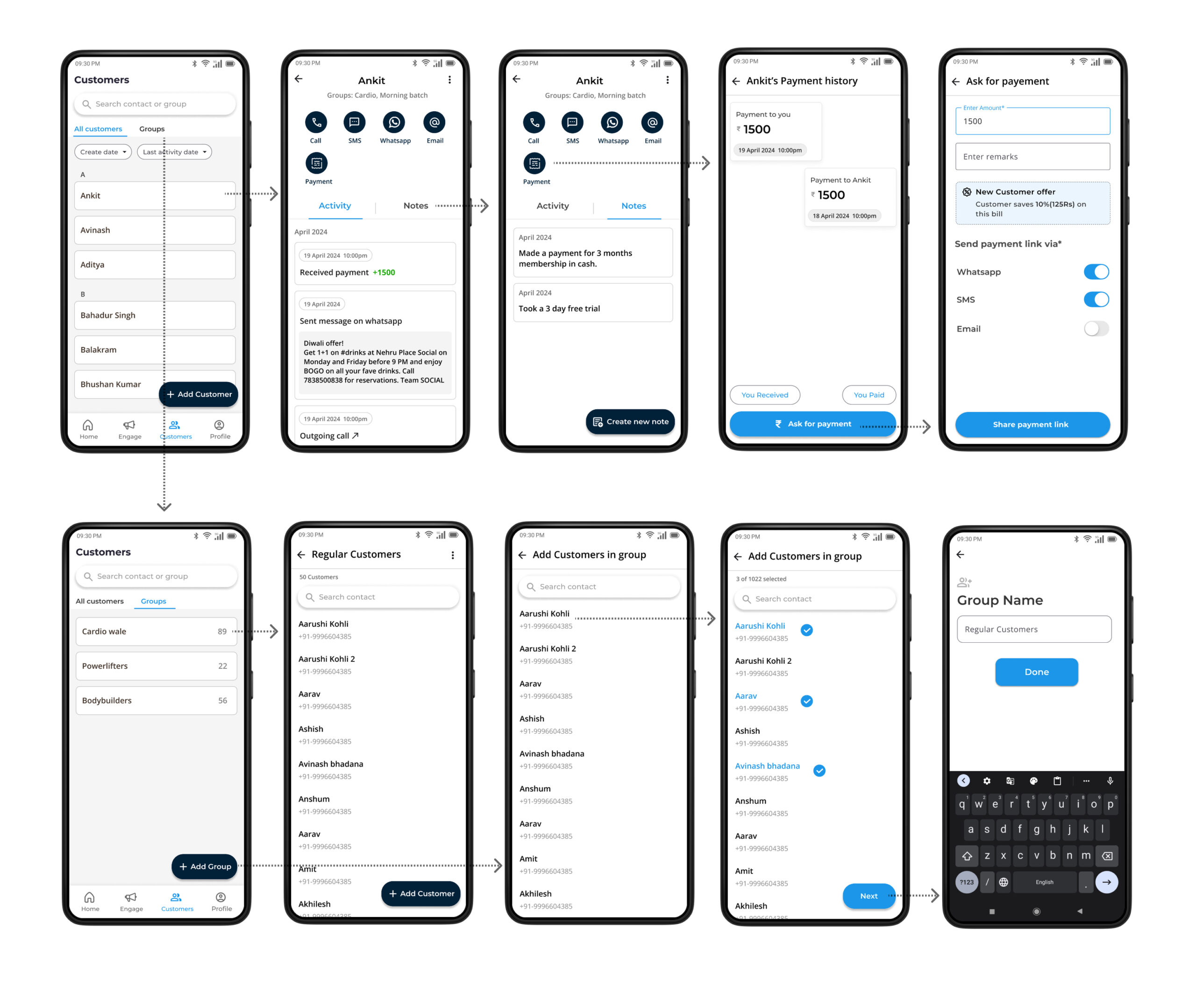
Smart Payment Link Sharing
We designed a simple flow for users to share UPI payment links via SMS or WhatsApp. Users could request payments, set due dates, and track responses—all from a single screen. Automatic payment reminders were built-in, helping businesses recover dues without needing to chase customers manually.
Localized & Inclusive Interface
Our target audience included non-tech-savvy business owners from Tier 2 and Tier 3 cities in India. So we localized the UI with support for Hindi and Hinglish, kept visual hierarchy strong, and reduced jargon. Icons, colors, and button placements were optimized for thumb use and readability.
Testing
To validate our assumptions and refine the experience, we conducted multiple rounds of usability testing with real small business owners. Our goal was to ensure that Grahak Setu not only looked simple—but felt intuitive in the hands of our users.
👥 Participants
We recruited 12 participants representing our core user segments:
Local shopkeepers (grocery, clothing, electronics)
Service providers (salons, tuition centers)
Freelancers (tailors, tutors)
All participants were Android users from Tier 2 and Tier 3 cities in India, with varying levels of digital literacy.
🎯 Objectives
Can users complete key tasks independently?
Where do they hesitate, drop off, or feel confused?
Do icons, flows, and terminology resonate with their mental models?
Testing Approach
Format: 1:1 remote sessions via Google Meet (moderated)
Tools Used: Figma interactive prototypes, Maze for unmoderated click tests, Google Forms for feedback collection
Tasks Included:
Sending a WhatsApp message using a template
Requesting payment via UPI link
Navigating the home dashboard and reports
Key Learnings
Template Discovery: 70% of users missed the template section on the first try. We redesigned it with visual previews and better hierarchy.
WhatsApp Integration: Users expected WhatsApp to launch immediately after hitting “Send.” We streamlined the flow by auto-launching WhatsApp with a preview.
Terminology Confusion: Words like “campaign” and “broadcast” felt unfamiliar. We replaced them with “Send Message” and “Reach Customers.”
Action Confirmation: Users wanted feedback after performing key actions. We added micro-interactions and confirmation modals to reinforce success.
Outcomes
Post-testing improvements led to measurable results:
⏱️ 34% faster task completion during follow-up tests
📈 2x increase in template usage after UI tweaks
💬 Positive feedback on clarity: “It’s like talking to my customers, not using an app.”
Usability testing played a critical role in shaping Grahak Setu into a tool that aligns with the daily habits, expectations, and comfort zones of real business owners. It reminded us that great design isn’t just about polish—it’s about clarity, empathy, and simplicity at scale.

 Testing Approach