Lessons, insights and learning on designing a drone flying experience that surpassed the competition by multiple folds in terms of quality of user experience measured across various standard UX metrics.
I joined Neosky as a Product Designer. Which is India’s first consumer drone company. It is a wholly owned subsidiary of RattanIndia Enterprises. When I joined company was at a very early stage. We had a drone and remote controller prototype designed. Now the next thing that was required was a mobile application that would be used to fly the drone along with a remote controller.
So how it works: There’s a remote controller that connects to a mobile phone via a USB cable and then using the drone application on the phone you can fly the drone.
Now my team’s task was to design a mobile application for the drone
The Challenge for me was to build a simple yet powerful drone mobile application from scratch.
Chapter 1: Exploration and User Research
We started with user research to expand our understanding of users and build empathy with them. To do so me and my fellow designer Rachna brainstormed and made a research plan encompassing suitable research methods with a rough timeline.
I started with a participatory design approach, including our end users from the beginning of the design process. To do so I started a program called Building with User Program
Building with the user program
Building with users program is a scaled and participatory approach to co-creation with end users. It helped our team gain access to our end users. It was a long-term agreement with some users to involve them in a co-creating process. onboarded 3 users, resembling our 3 user personas.
The selected users helped us by providing feedback and participating in user interviews, workshops, and usability tests. The insights from the users were used to inform the team’s designed experiences and the scope of the product.
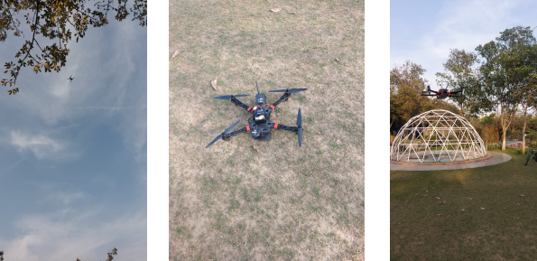
As they say, there’s no better way to understand people than going out and talking to them. I talked to people who fly drones in their day-to-day lives some advanced users like drone pilots and some occasional drone users such as photographers
User Interviews
I conducted semi-structured user interviews with our sponsored users to understand their overall drone flying experience and the challenges and pain points encountered in the process. It also helped us in getting a deeper understanding of our target customer’s attitudes, beliefs, desires and experiences.
Fly on the wall or Contextual Enquiry
To uncover more hidden insights I observed the end users’ flying drones in their natural context as they normally would.
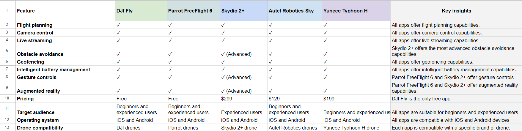
Competitive Analysis
We conducted a preliminary competitive analysis to assess which aspects our competitors were prioritizing differently than us. We discovered that we actually have many of the same core features in our defined scope. However, there was still a significant opportunity to improve the design and development of these features and functionalities.
After Competitive analysis, we also did a task-based usability test with our competition and market leader DJI’s mobile application to find out what’s working and where is the scope of improvement.
Key Findings
The information architecture of the DJI and other drone applications was confusing, especially for first-time users or people who occasionally fly drones.
While flying a drone there’s a very limited time to act so the features should be easily and effortlessly accessible.
Ergonomically and due to glare from the mobile screen, controls on the remote controller should be easily accessible than on the mobile.
Chapter 2: Analysis and synthesis of findings
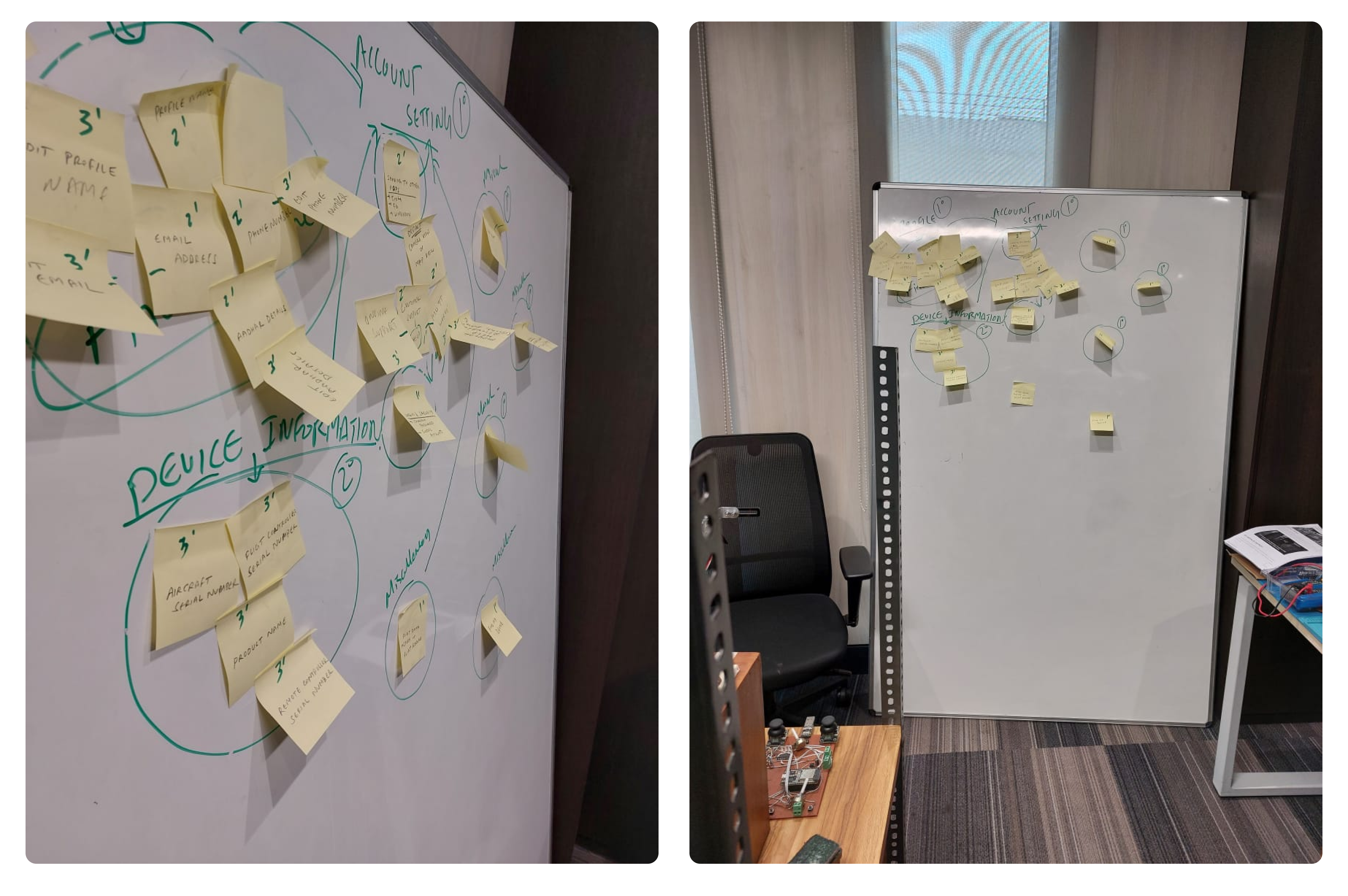
Affinity mapping
Now after the user research, We made an affinity map in collaboration with developers, product managers, chief innovation officers and business head to organize the top-level data and findings from the research. We grouped the findings based on similarities in common themes.
After having a significant understanding of our customers I build user personas and empathy maps to share the learning about the user with the team in a more succinct and digestible form.
Empathy maps
I made empathy maps to create a shared knowledge base among the cross-functional team, bringing everyone on the same page and most importantly building that empathy with the personas.
Now it was time to design information architecture.
We observed from the usability tests that in terms of information architecture our top competitors’ mobile applications were all similar and confusing to understand for everyday people who aren’t advanced users.
So we decided to make a bold move of making our information architecture quite different from the other drone applications available in the market.
Information Architecture
I did a card sorting exercise with our sponsored users as participants to understand their mental models.
Based on learnings from how participants grouped and categorized the cards, I designed the information architecture of the mobile application.
Though the architecture we came up with a quite different from the drone industry we believed on the data we got from usability testing and card sorting and took a leap of faith and went ahead.
Chapter 3: Ideation and Prototyping
In the ideation phase in collaboration with cross cross-functional team, I generated a broad range of ideas. For inspiration, I also explored solutions in alternative spaces..
Wireframes
After having a direction and solid understanding of the problem and possible solutions I began to produce multiple different designs to put in front of users and internal stakeholders to validate the concept.
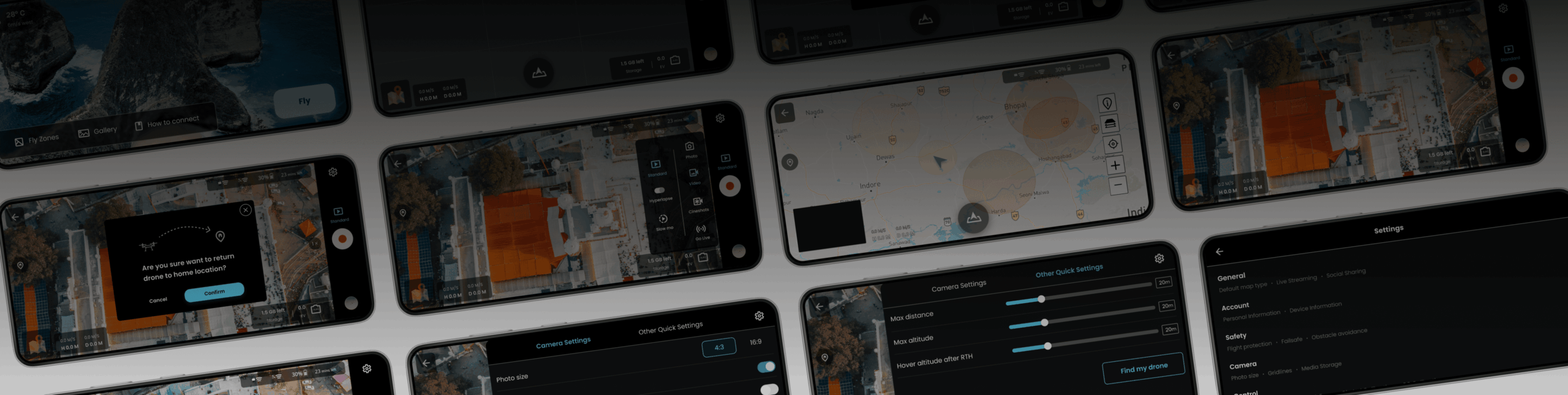
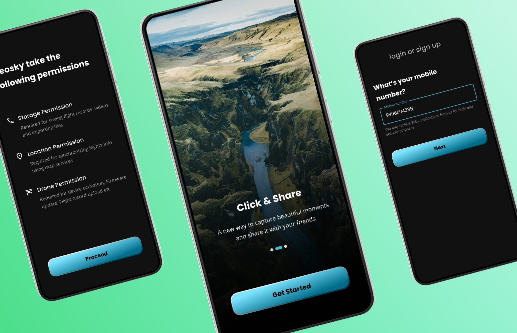
High-Fidelity Design
After having a direction and solid understanding of the problem and possible solutions I began to produce multiple different designs to put in front of users and internal stakeholders to validate the concept.
Flight and camera view
Profile and settings
Chapter 4: Validating using user testing
Continuous and early testing was extremely important in this project, and as a result, usability testing was conducted after significant progress. Tests were arranged in small, focused sessions with sponsored users aimed at iteration and incremental improvement.
We measured the application performance using 3 behavioral proxies Task completion time, user error rate and task success rate.
I did the moderated task-based usability test using the prototype made in Figma. I gave each user a set of tasks to complete in the mobile application. I recorded the task completion time, task success rate and errors made by the user. alongside I also observed their reactions and responses.
Avg task completion time: 23 secs
Task success rate: 91.6%
User error rate: 2.5%
We also did a the same task based usability test with the our closest competitor’s mobile application and we found that our application scored at least 10x better against all these user experience metrics.